Case Study
1. Introduction
Transitioning to a microservice architecture brings many benefits to a growing application. The scalability by component, separation of concerns, and flexibility of technology used are just some of the ways it provides immediate benefits. The main drawback of a microservice architecture is it exponentially increases the age-old problem of any technology: what if something stops working?
The question is not if something will fail, but when. What makes this worse in a microservice vs. monolith architecture is that finding the source of failure is much harder. With the increased complexity created by each additional service, every relationship and dependency, no matter how small, could be the culprit. Was it the checkout service? Inventory? Authentication? The thank-you email?
Knowing which service failed is only the first step — next is knowing why it failed. Was it due to a spike in traffic? Was it a bug in the code? Bad input from the user?
This is where telemetry data, specifically metrics and tracing, come in. With metrics, the user can see the number of requests and errors hitting their application for a given interval. With distributed tracing, the user can track how a request travels through their microservice architecture, from the moment a user clicks a button until a response is sent back to them.
Let's look at a concrete example of where this need often arises: Evo T-shirts.
1.1 Evo T-Shirts
Evo T-shirts, an e-commerce site, has recently skyrocketed in popularity. What started as one person’s side-hustle has now outgrown a monolithic architecture. The powers that be have decided to move to a microservice architecture for better organization. Oliver has led the team of engineers who built Evo T-shirts for years, and he continues to oversee each sub-team in their now assigned service.
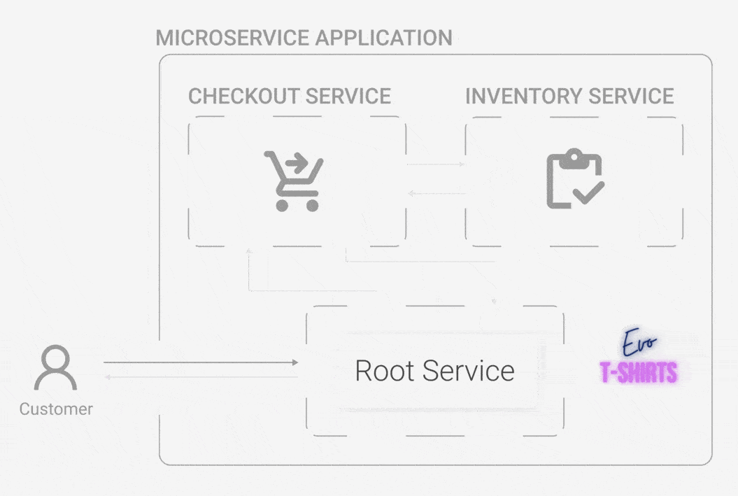
One day, he wakes up and finds that the site has been inundated by a stream of bad reviews overnight. What happened? Customers are complaining about not being able to buy products, and many of them sign off swearing they’ll never try the site again. While Oliver is confused, the CEO wants answers. Now.
Oliver quickly jumps on the site and buys some t-shirts, trying to recreate the errors that customers are experiencing. Unfortunately, he doesn't get any errors, his cart is accurate, and he is able to complete his purchase without incident. He checks the status of each service, but they’re all running just fine. What is going on?
Several engineers on his team try recreating the problem, too. Some of them receive the same errors customers were complaining about, while others do not. They’re not sure why it’s happening for some and not others. Oliver’s last resort is to look at the logs of each service, hoping they’ll contain information about the alleged errors.
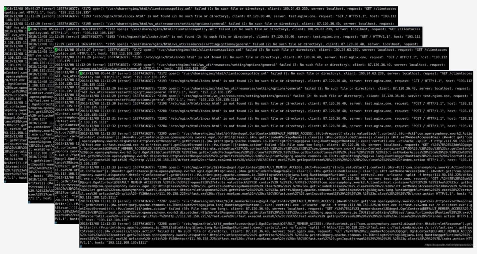
His frustration mounts as he continues to scroll. The logs are endless and difficult for him to parse. He sees something about an error here and there, but it’s unclear where it’s happening or why.
Oliver and his team would greatly benefit from an observability solution right about now. Horus would provide just that.
1.2 What is Horus?
Horus is an open-source observability solution for microservices. Users can generate, store, and visualize correlated telemetry data, allowing them to see the real-time health of their application.
Because the metrics and traces are correlated, the user can click on a particular metric data point and view all the traces that happened in that time interval. This allows the user to easily discover where the customer of the app received an error, which makes it easier to start fixing it.
If there is an uptick in errors, Oliver can quickly jump through that metric error data point and see traces that happened in that timeframe. By deep-diving into the traces, he can see the exact request and exact error. Then all he has to do is fix it.
Before diving further into Horus, let’s take a step back and better understand the realm of telemetry data and observability.
2. Telemetry
2.1 What is telemetry?
Telemetry is “the collection of measurements, or other data, at remote or inaccessible points and their automatic transmission to receiving equipment for monitoring." 1 Put another way, telemetry is a collection of data points that represent information about an application's health and can be used for monitoring and observability purposes. Want to know how your system is doing? Look at the telemetry data.
There are at least three essential observability data types: metrics, logs, and traces.
2.2 What are metrics, traces, and logs?
Metrics are numeric measurements. A metric could represent a numeric status for a moment in time (% of memory being used) or it could be an aggregated measurement (how many clicks per 10 seconds). A metric data point usually includes a name, a timestamp, and one or more numeric values. Metrics are considered to be the macro level of telemetry data and can answer questions like:
- “Is the application performing slower than it should be?”
- “Are users encountering errors while using the application?
- "At what time of day are we receiving the most amount of requests?"
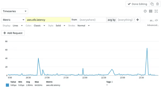
Why the application is performing this way may still be unclear, but the metric brings clarity to the broader picture of the application's overall state and performance. For example, when monitoring the app’s network, there could be a sharp uptick in requests per second. This could indicate good business — or a DDoS attack. Either way, the information encourages the developer to pay attention and learn more.
Logs are the most detailed data type, so it’s easy to assume they’re immediately helpful. They can be, but all of the details can make them hard to parse and understand. Logs are often unstructured, sporadic lines of text that the system creates as it does various tasks. Logs are great when diving into the details and seeing the step-by-step explanation of what a system did, or attempted to do.
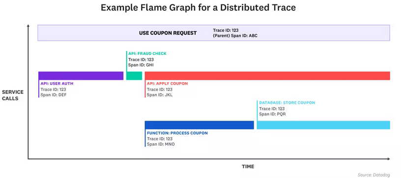
Traces are the newest telemetry data type and are used less than metrics and logs. As a newer technology, it can sometimes be harder to work with them in a meaningful way. However, when properly captured and queried, they offer a wealth of information.
A request can pass through a host of different services, making them harder to pin down and understand what happened. A trace provides a view of a request throughout its lifetime in a system: where it starts, where it goes to next, and where it finally terminates, throughout a distributed infrastructure.
Traces capture not only the whole journey of request, but each step of the way, and how long each step took. Each step is commonly referred to as a span (short for a span of time).
2.3 Metrics and Traces for Evo T-Shirts
With that context in mind, let's return to Evo T-shirts. Aside from his immediate need, Oliver and his team generally want to be able to get a bird's-eye view of how Evo T-shirts is performing over a daily or weekly period. If the marketing team decides to run a promotion or sale, they may even want to visualize how the online store is performing on an hourly basis. Any dropped requests, errors encountered, or steep increases in latency could impact the overall user experience, costing the company money.
Metrics seem like a good path to pursue here. Oliver could simply run a monitoring system alongside the application, see the overall health of the store, and get instant feedback on any issues that occur.
Metrics aggregate all monitoring measurements and export them at specific time intervals. All metric data is included in this aggregation and the exporting cost does not increase with higher traffic. Therefore, a metric measuring the average latency of an endpoint will also include the fastest and slowest requests that took place in that time period. A calculation of the error rate will always be accurate as the counter will only be incremented if an error is thrown in the application.
Although this is a great place to start, there are some limitations in taking a metric-only approach.
If Oliver's application were to start detecting errors, or there was a sharp increase in overall latency, Oliver wouldn't be able to identify where across his microservice infrastructure the complications were materializing. Oliver needs to meaningfully query the telemetry data, using the metrics as indicators, to resolve the issue and get the application back up and running again.
Traces are the natural option here. They provide detailed breakdowns of individual requests by supplying contextual information around how the journey of the request unfolded as it moved through the system's infrastructure. Furthermore, traces excel at showing the relationship between services as well as capturing high-cardinality data about each specific request. This helps pinpoint the source of an issue in the distributed system quickly and accurately.
By establishing a relationship between the macro nature of metrics and detailed nuances of traces, Oliver is able to achieve the observability coverage he's looking for by recording the interactions that are taking place across the distributed services. Oliver can then "jump" between a high-level and low-level perspective by switching between metrics and traces.
horus-agentAll of this looks like an exciting path forward to solving the application monitoring problem for Oliver and Evo T-shirts, but how does a telemetry system work exactly? Let's look at the components and architecture that make this monitoring solution possible.
2.4 A Telemetry System Architecture
In Software Telemetry, Jamie Riedesel describes software telemetry as "the systems that bring you telemetry and display it in a way that will help you make decisions." 2
A software telemetry system is composed of three major stages: emission, shipping, and presentation. In essence, it will ingest data, process it, store it, and make it retrievable to the end-user. This applies to every type of telemetry data: metrics, traces, and logs. Let’s break down these stages and see what function they play in a wider telemetry system.
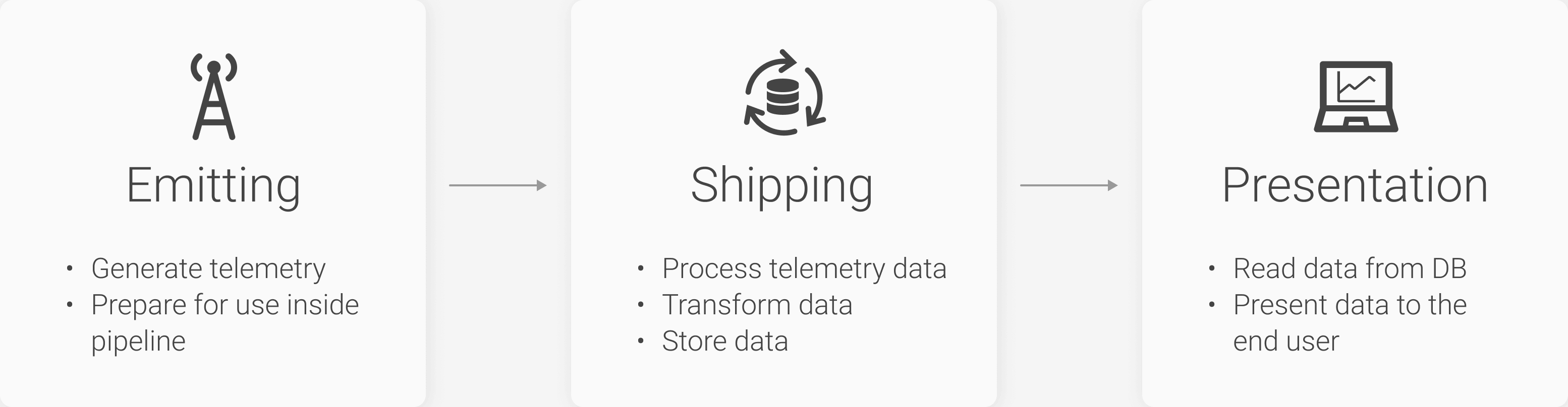
The Emitting Stage
The emitting stage is the first stage in the telemetry pipeline architecture. It is largely responsible for generating telemetry data in a production application. This stage can either allow the telemetry data to be emitted and stored locally, or it can be forwarded to the shipping stage to be batched, processed, and exported to a remote location.
For Oliver, it's important that his own application is decoupled from the telemetry system so that both components are able to operate independently of one another. It's common practice today to implement a telemetry generating emitter through the form of an SDK. OpenTelemetry is an example of a leading developer tool kit that could be implemented to generate and emit telemetry data. We'll discuss OpenTelemetry in greater depth later on.
The Shipping Stage
The shipping stage is largely responsible for receiving the raw telemetry data from the emitter (in the form of either metrics, logs, or traces), processing it into an accessible data format, enriching the data if needed, and saving the data in a storage mechanism. A large design component of the shipping stage is to consider how to organize and store the raw telemetry data that is generated by your emitter.
Telemetry data is generated continuously and at a high frequency. Therefore, the database needs to be able to handle this high write intensity while also being able to query data when required. Should the frequency of the incoming data surpass the processing capability of the database, it may be wise to consider the implementation of either a queue or event bus to manage the data influx. Both these options also provide the benefit of reducing the possibility of data being dropped if there is a database backlog or being lost if the database goes down.
The Presentation Stage
The presentation stage is the last phase of the telemetry pipeline and is, crucially, the only one where most people will interact to make important design and business decisions. This stage's purpose is to transform telemetry data into useful, measurable, and human-friendly insights regarding how an application is performing. The presentation stage is often a separate architectural component to the emission and shipping stages and is regarded as the user interface of telemetry architecture. The presentation component will pull from a given data source, format the data to be interpreted by the UI, and visualize the data in a human-friendly way.
The presentation stage is often what large SaaS monitoring solutions use as their primary selling point. If the telemetry architecture doesn't implement this stage itself, the user will just do it themselves either by creating their own graphs or outsourcing to a separate UI component. Therefore, telemetry presentation is always a key component of telemetry architecture even though it does not directly impact the generation or production of telemetry data.
That’s a lot to digest! And in a way, that’s an important point for Oliver. Although he finds this interesting, he’s more interested in getting his application performance management (APM) tool up and running than understanding it deeply. How can he go about monitoring Evo T-shirts?
3. Existing Solutions
3.1 SaaS
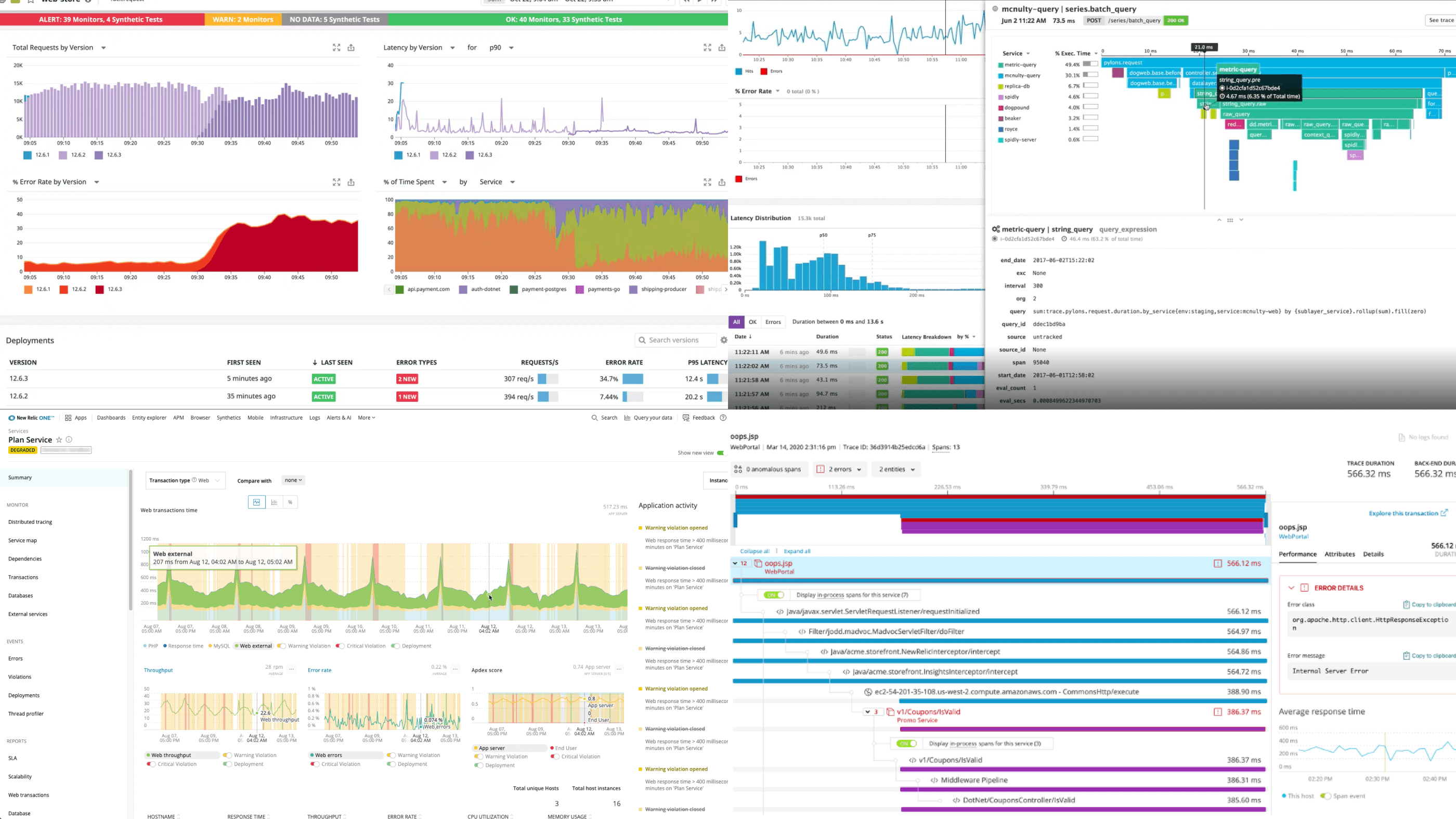
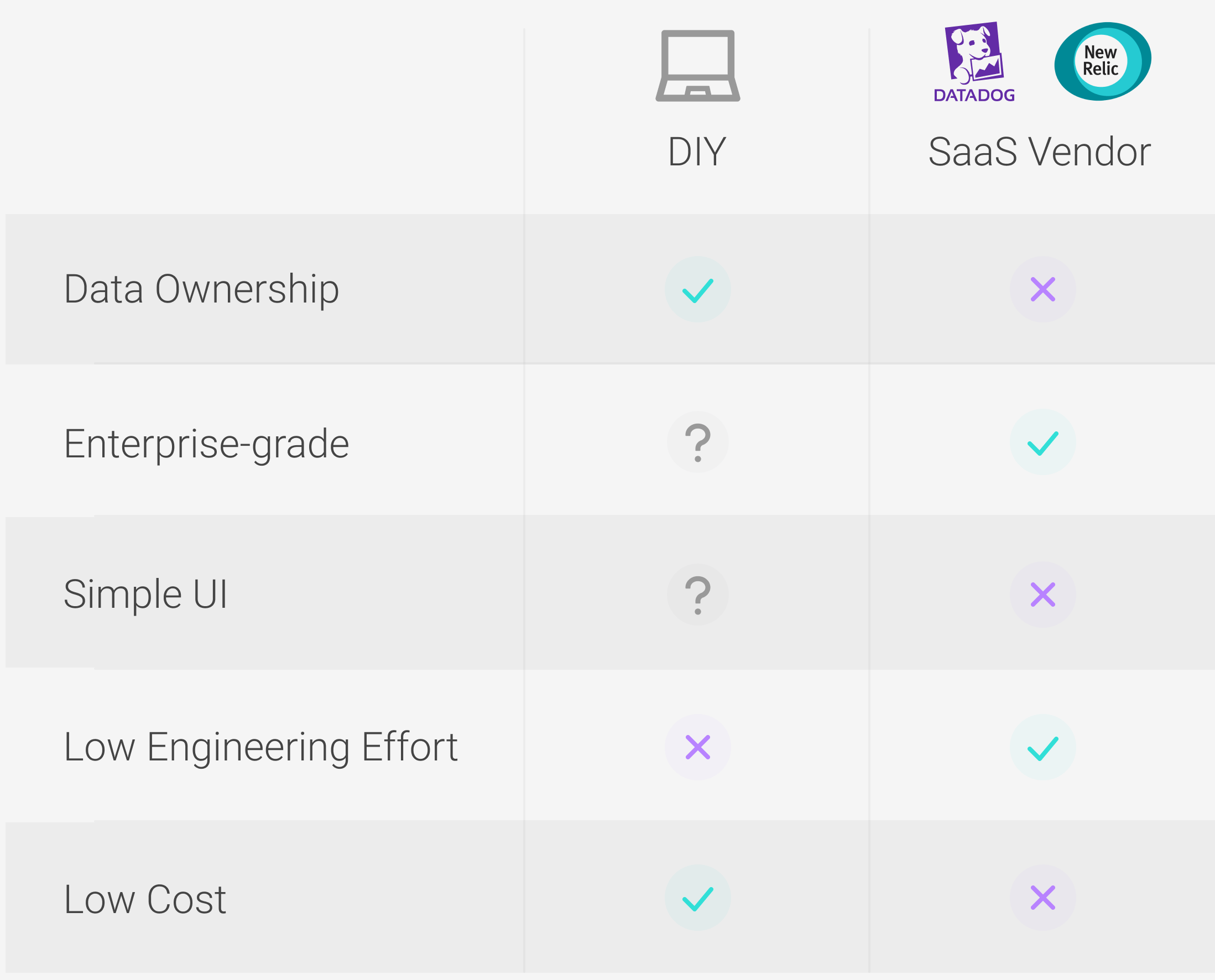
Oliver has several options to explore for a full application performance management tool. His need for a simple setup steers him to look at all-in-one options first. Third-party services like NewRelic and DataDog are a good place to start, as they provide out-of-the-box full observability platforms. Aside from the user copying and pasting some provided code into their application (the “emitting” or instrumentation phase), it’s all connected, set up, and ready to go.
Hosted data storage comes with these end-to-end options. The user doesn’t even need to be aware of the kind of database being used or how it is queried by the UI; all of those details are abstracted away and the user can interact with the data exclusively through the provided UI.
Their polished UIs include dashboards that display a range of metrics and trace sections that allow filtering and deep-dives (reminder: that’s what Oliver wants!). Many of these third-party services (including NewRelic and DataDog) go beyond metrics and traces and include both logs and events with dedicated sections, dashboards, correlations, and graphs. They often have extensive documentation to get the user up and running.
As nice as this sounds, these options have immediate drawbacks for Oliver. First, he wants to retain ownership and flexible manipulation of the data. With NewRelic and DataDog, he can only interact with his data through pre-defined avenues. If he would ever leave the free NewRelic plan, he would forfeit all of his data as only paid plans can export data. Furthermore, with the free plan, NewRelic only keeps Oliver’s traces for 8 days; that will make it harder to do analysis that spans longer than a week. DataDog doesn’t offer a free plan outside of a 14-day free trial of the paid service.
Additionally, both NewRelic and DataDog are so feature-rich that their UIs are overwhelming for someone unaccustomed to observability. They have a steep learning curve that requires the user to know exactly what they want and hunt it down. Oliver doesn’t need lots of bells and whistles. He just wants to see basic requests per second, error count, latency health, and the traces behind them. Even if Evo T-shirts was willing to pay for these big services, it would be overkill for their needs. For them, the income generated would be better spent on improving the products and raising the business profile through marketing.
3.2 DIY
Because Oliver wants something simpler and custom to their needs, he’s left with a DIY via Open Source approach. He can essentially piece together an observability platform by creating a telemetry pipeline. He has a plethora of options for how to stitch it all together: OpenTelemetry, Jaeger, Zipkin, Prometheus, Grafana, etc. Then he has a long list of questions to research:
- What does each of these tools do?
- Where do their purposes end and begin?
- Can they all seamlessly work together?
- Should he batch export traces and metrics? Why or why not?
- What database should he use?
- Should he store metrics and traces together or separately?
- How should he connect metrics and traces?
- What pieces of information should he store about traces?
- And on and on...
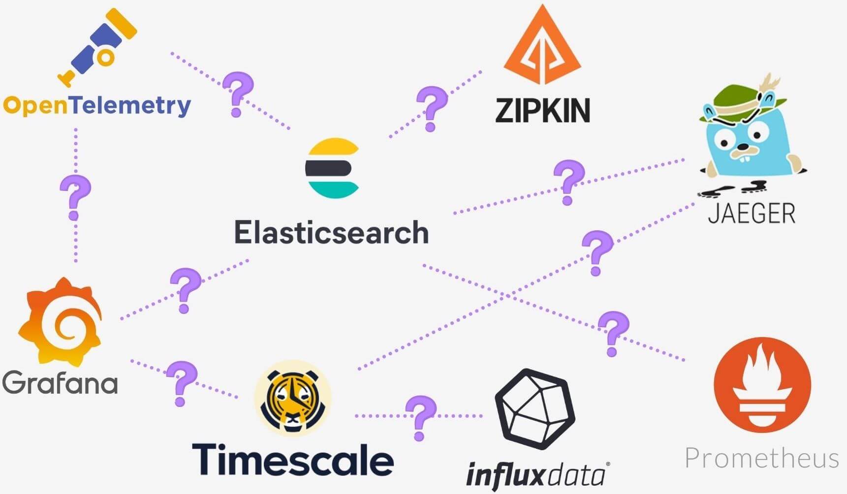
This incurs a time cost that’s difficult to measure. Oliver and his team could combine well-established telemetry generating options like Prometheus (for metrics), Jaeger (for traces), and Grafana (for visualization), but this also means learning all three products (and more) and configuring them to work effectively together.
What Oliver needs is an Open Source, all-in-one service, that allows him to retain ownership of his data and has a simple, meaningful connection between metrics and traces displayed in a simple UI.
Lucky for him, that’s exactly what Horus is.
4. Introducing Horus
Horus is an open-source observability solution for microservices. Users can generate, store, and visualize correlated telemetry data, allowing them to see the real-time health of their application.
Designed with the user in mind, it makes the integration, generation, and visualization of application monitoring seamless and straightforward.
Built using OpenTelemetry, Horus encompasses industry-leading observability standards, technologies, and best practices to ensure that the generated telemetry data is always in the user’s hands and under their control.
With Horus, the user has the option to track both application metrics and traces to gain the observability coverage they need. Horus correlates the user’s application metrics with the traces that occurred in that given time period, providing full transparency over the interactions taking place across their system’s infrastructure in real-time.
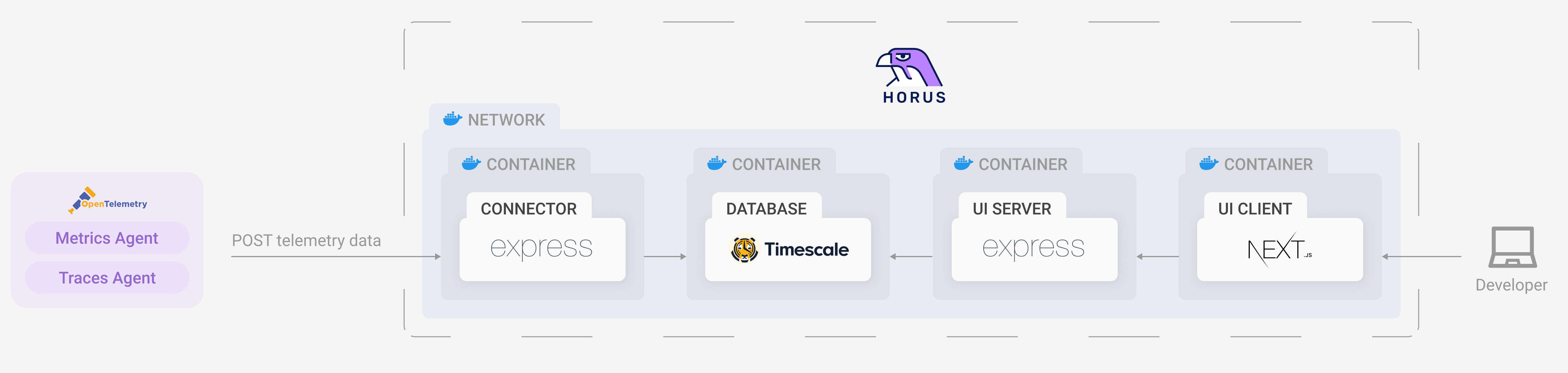
Horus goes beyond just the emission of telemetry data. Through Docker, it sets up a network of Horus components on the user’s server to receive, format, store, and visualize incoming telemetry data.
Horus removes the friction of combining components like Jaeger, Prometheus, and Grafana together to achieve observability by providing purpose-built components that reduce the potential set up time from hours or days to minutes.
An additional key benefit of Horus is giving the user complete ownership over their data. Using a Dockerized Timescale instance, there is no storage time limit or implicit cost involved in storing the user’s telemetry data, contrasting most SaaS monitoring solutions. Horus takes out the configuration and formatting headache of storing telemetry data whilst still remaining totally free and under the user’s control. The cost of storing data is completely dependent on where it’s hosted, and the user can decide what works best for them.
The Docker network also contains an interactive visualization layer that automatically graphs the incoming metrics the application generates.
There are three built-in metrics graphs that are available out of the box:
- Total requests per 10 seconds
- Total errors per 10 seconds
- Latency Health over 10 seconds
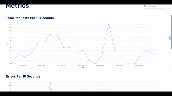
Each graph adjusts accordingly to the selected time window, giving the bigger picture of how the application is performing across a wider time scale.
Horus streamlines the user experience, providing all that they need to get going from the outset. The user can flow seamlessly between metrics and traces by clicking on the graph and being taken directly to the traces that occurred in that time window.
Horus allows Oliver to set up an open-source telemetry pipeline by automating the manual work. He gets the benefits of a DIY solution, but without the hours of work it would require.
4.2 Horus and Evo T-Shirts
Horus is the perfect solution for Oliver. He’s able to get both metric and tracing coverage without needing to learn any other technologies. Horus is well-documented and designed to be set up in just minutes, so there’s no time wasted. Oliver also gets to maintain control over the data without needing to export it to a third party. Best of all, Horus is free from the outset. There are no time or storage limitations, so Evo T-shirts can invest the time and capital back into the business.
5. Horus Architecture
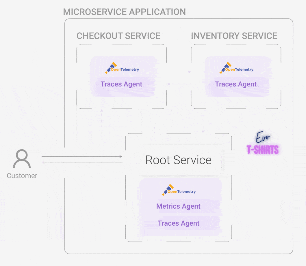
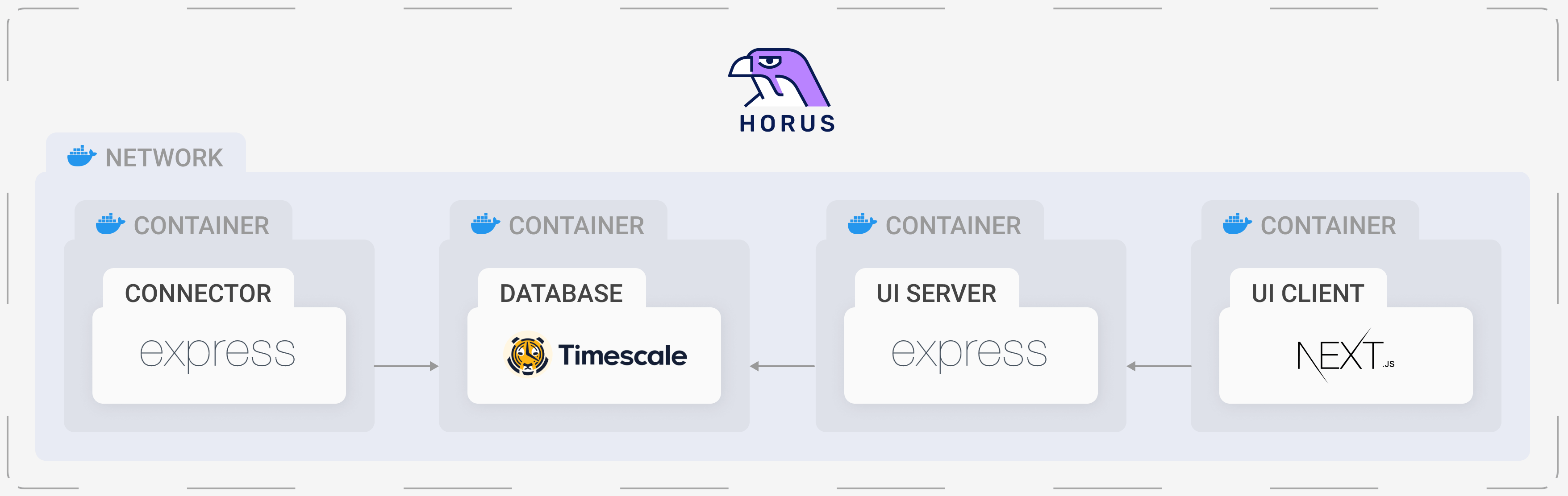
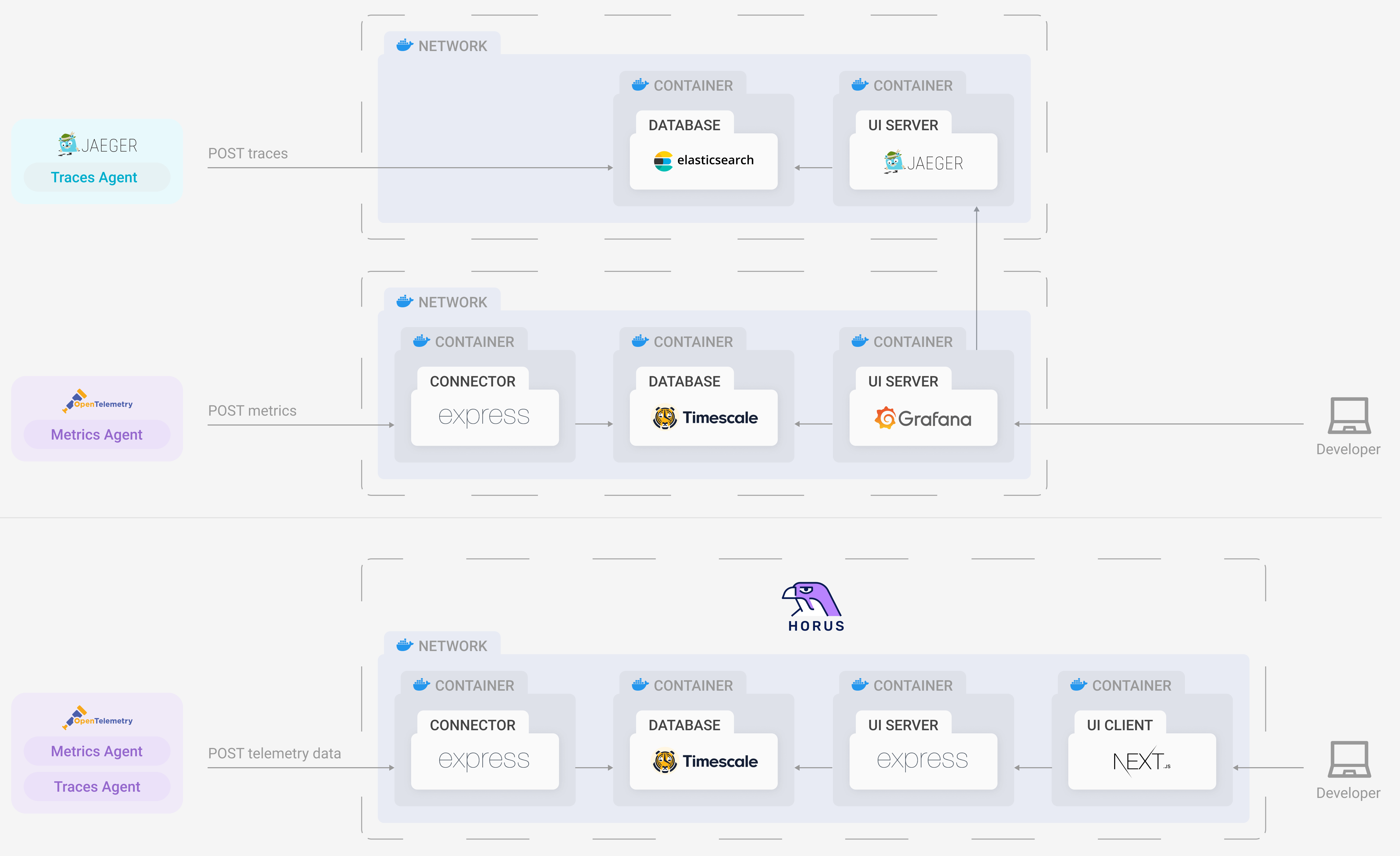
Horus has four distinct but interrelated components: the horus-agent, connector, database, and UI. We wanted to develop an end-to-end observability tool, which means all the way from generating metrics and traces to a UI where the user can visualize them.
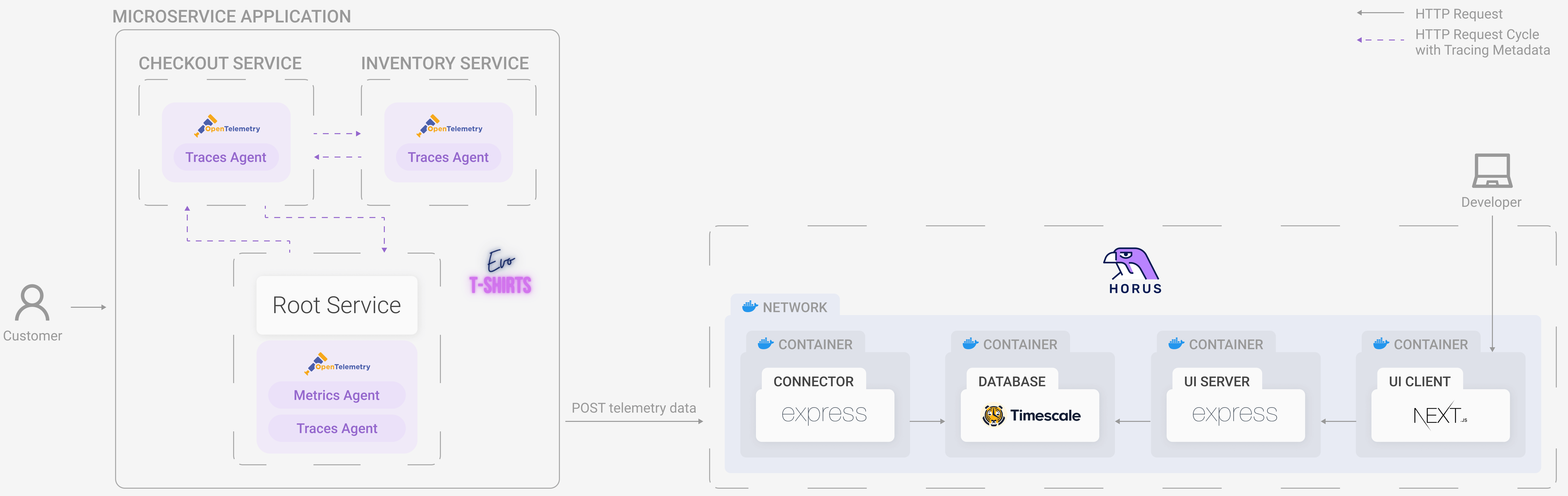
5.1 Horus Agent
The horus-agent embodies the first stage of a telemetry architecture: the emitting stage. Once installed in the application, it generates metrics and traces, collects them, and sends them to the connector. It consists of an npm package that the user installs and configures slightly. Currently, Horus is for Node applications, and part of the future work is to develop instrumentation — the horus-agent — for additional languages.
horus-agent installedMany open-source solutions start directly after the emitting stage. These solutions point the user to OpenTelemetry and have them set it up themselves. We saw the emitting stage as imperative to automate and simplify for two main reasons. First, OpenTelemetry is difficult to use and understand for a newcomer to this sphere. As it’s still an emerging technology, the documentation for it is somewhat sparse. Thus, it is difficult to make it work without significant trial and error.
Second, there are many types of metrics that the user could generate, and this can be difficult to figure out. Horus is made to work with three: number of requests, number of errors, and latency. These three are the most common and the most important metrics across even the SaaS platforms. By instrumenting these ahead of time, we take the guesswork out of which metrics to generate.
Additionally, we implemented a queuing and batching system for the traces. By sending traces to the connector in this way, we allow much higher requests per second to be successfully received. Through load testing with Artillery.io, we saw how this feature of the instrumentation dramatically improved successful requests per second — by literally 1800%.
OpenTelemetry
We chose OpenTelemetry as our instrumentation and telemetry data type primarily because we wanted a singular tool for generating both metrics and trace. Some tools only generate traces (Jaeger, Zipkin) whereas other tools only generate metrics (Prometheus).3
Another reason that prompted us to use OpenTelemetry is its inclusion of a Node SDK which provides automatic generation of traces. This abstracts away the configuration of what information is on each trace or how they are even generated, and it sufficiently covers the details we wanted.
The auto instrumentation calls a single function which automatically detects and generates telemetry data. It then sends this data to the chosen endpoint (where the connector is located, described below), avoiding the need to add extra lines of code to the application.

The Node auto instrumentation package generates spans for a wide variety of technologies: HTTP, MySQL, Express, and more. We also chose to add MongoDB instrumentation for slightly wider coverage.
The main disadvantage of OpenTelemetry is its novelty. Because it is a project rapidly growing and expanding, the documentation can sometimes be confusing or downright nonexistent.
5.2 Connector
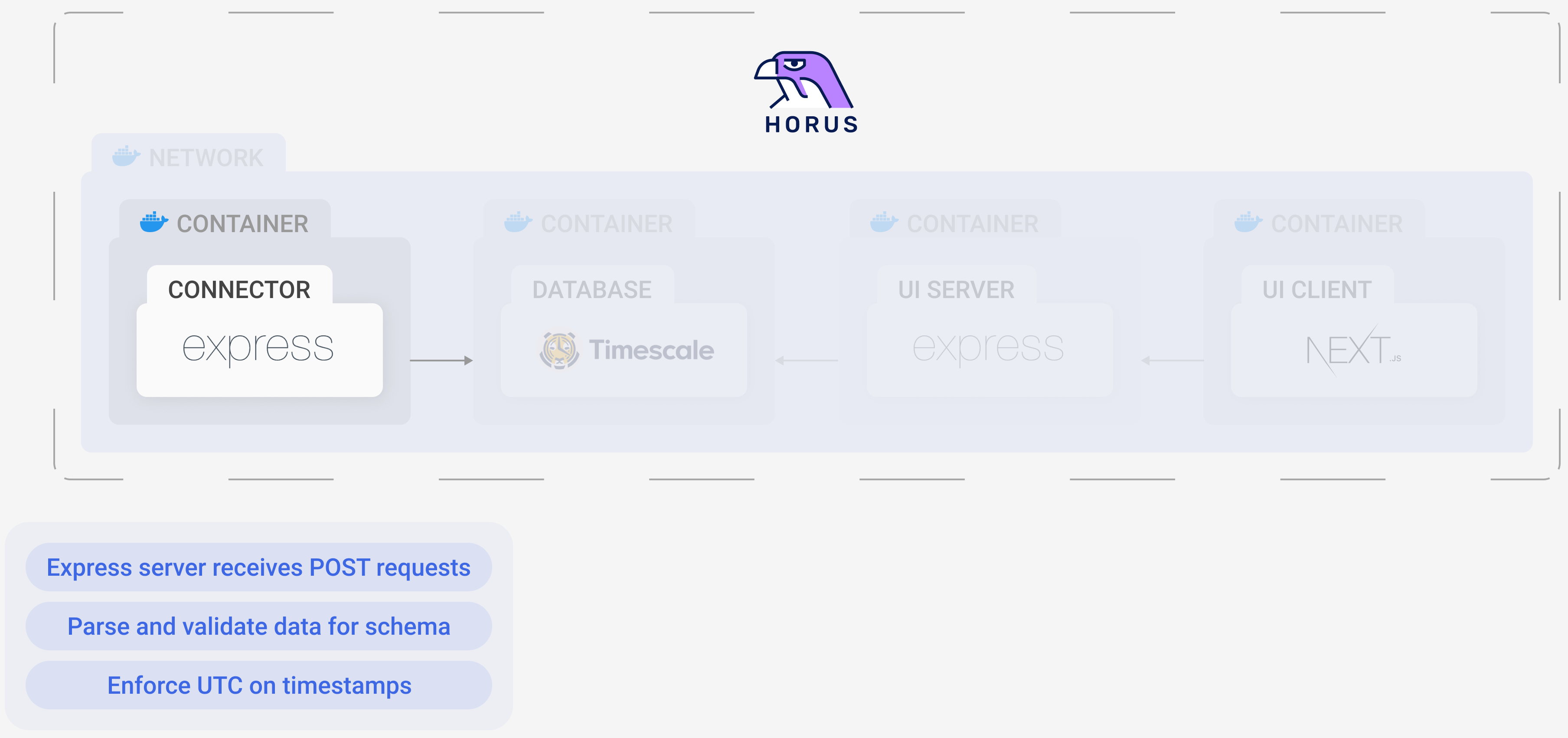
The horus-agent sends all the data it generates to the connector. The connector then parses and transforms the data for easy storing and querying. It inserts both the metrics and traces into tables in the Timescale database for future use.
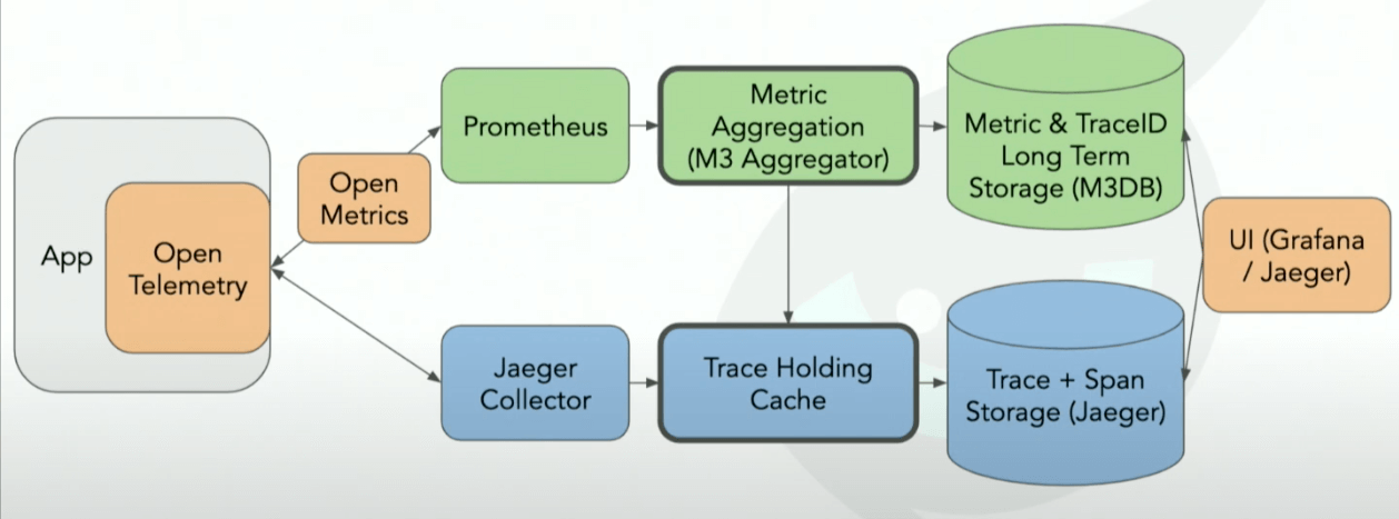
When using OpenTelemetry, it’s common to have an OpenTelemetry Collector. A Collector is a central location (a server) to send all exported telemetry data. Once there, the data can then be processed, formatted, and batch exported to the next stage of the telemetry pipeline. However, we decided to forego it completely. One of its main purposes is to ingest telemetry data from different sources (such as Prometheus and Jaeger) and then transform it into a common format. Since we used OpenTelemetry exclusively, a Collector was unnecessary.
5.3 Database
For a database, we chose a time-series database because it’s optimized for time-stamped data. Because time is a central part of our schema (how we chose to connect traces and metrics), having a time-focused schema and database is key.
Time-series databases are ideal for a high-rate of inserts and a low-rate of modifications and deletions. This is exactly what our use case is since when a metric or trace is created, there is no need to ever modify it.
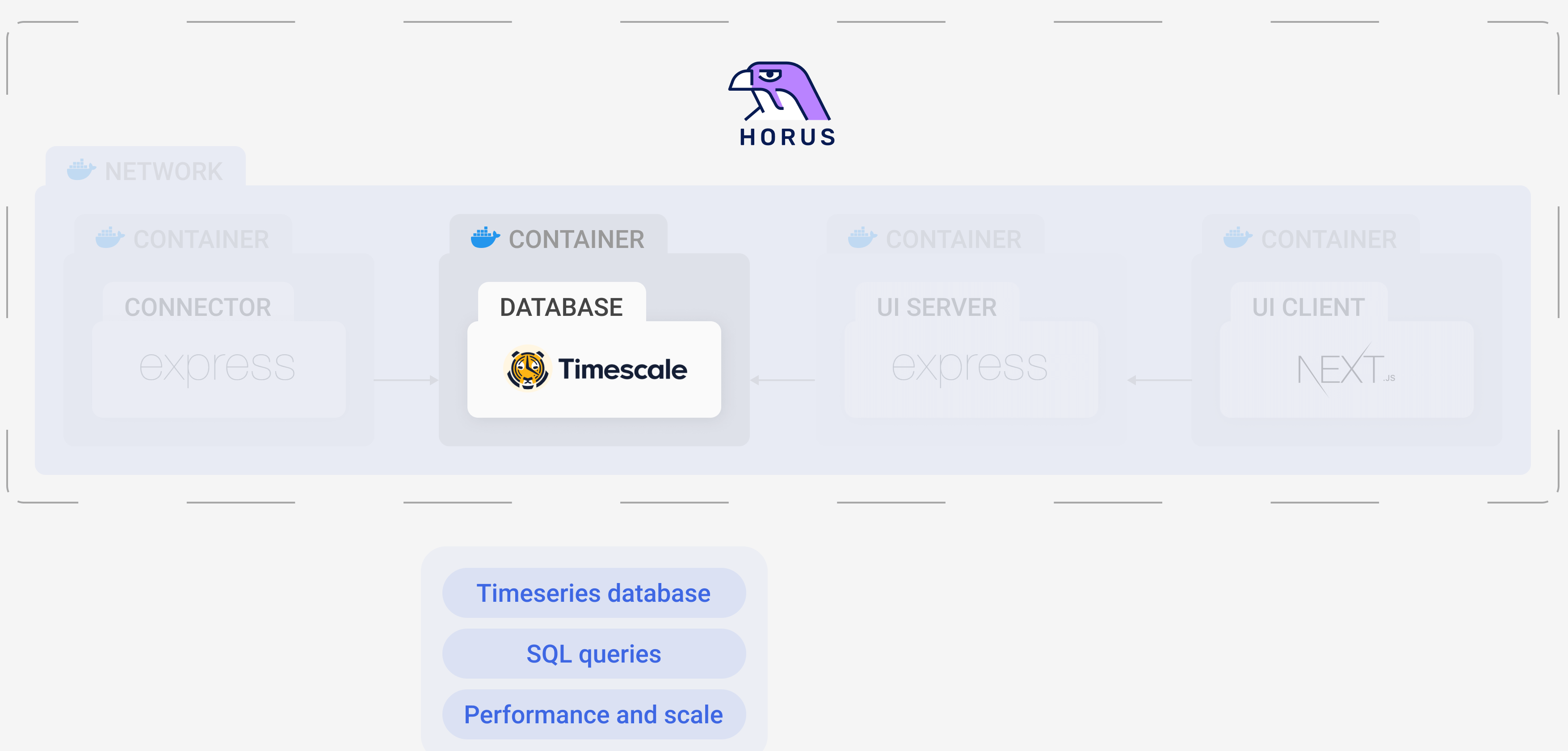
We chose to use Timescale specifically, which is a leader in efficient storage and fast queries for large amounts of data. Built on PostgreSQL, it also provides the familiarity of SQL as the query language. Furthermore, PostgreSQL stands on over 25 years of excellent engineering work; Timescale expands PostgreSQL through performance optimizations and lower cost due to data compressions. In short, the maturity and high performance of Timescale made it a natural choice.4
5.4 UI
The last part of the architecture, and arguably the most important to the user, is the UI. This is the primary component that the user interacts with and is the source of all data visualization for Horus.
After pursuing several other options (see Challenges and Trade-offs for details), we settled on creating our own UI. This allowed us to choose our database, customize the schema, and mold the UI into the intuitive vision we had.
The UI is composed of two parts: the client and the server.
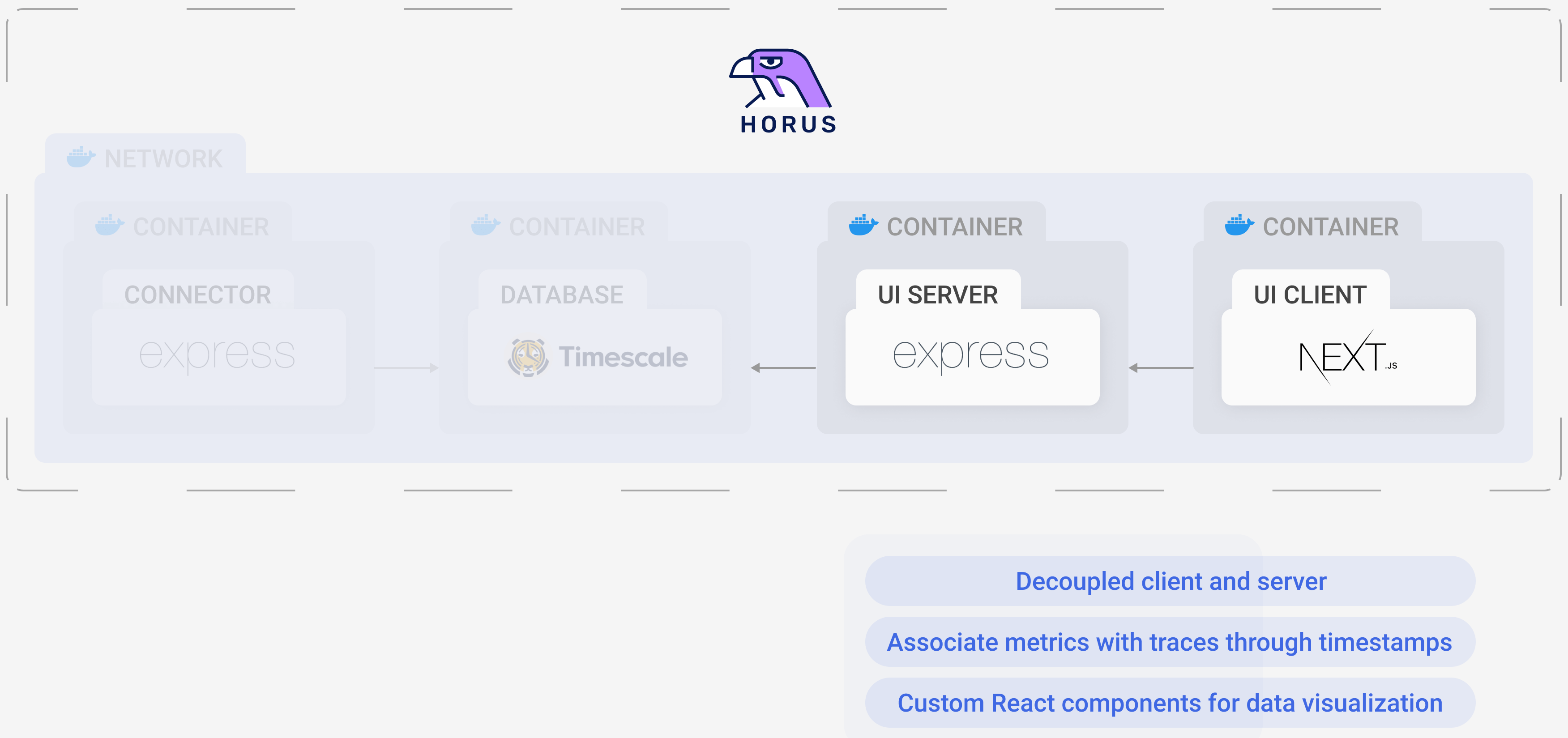
The server communicates with the TimescaleDB instance. It is an Express server that makes queries to retrieve data and then sends them on to the client in JSON format, where the data is then displayed in various graphs.
The client is a NextJS application, which is a React-based framework. It retrieves data from the server via HTTP and displays it in a way that correlates metrics and traces so the user can find what they’re after easily.
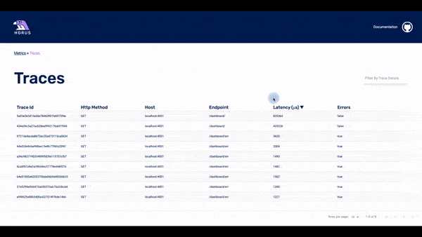
The UI has three pages: the metrics page, the traces page, and the spans page.
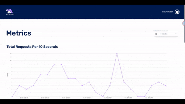
Initially, the user loads the metrics page, which acts as the home page. Here the user can see three dashboards with the three metrics: requests per 10 seconds, errors per 10 seconds, and latency of requests over 10 seconds.
The user can choose the timeframe of the displayed data: the last 15 minutes, last hour, last 24 hours, or last week. If they see something of interest, they can click on any of the data points in the dashboard and the UI will display to the second page: the traces page.
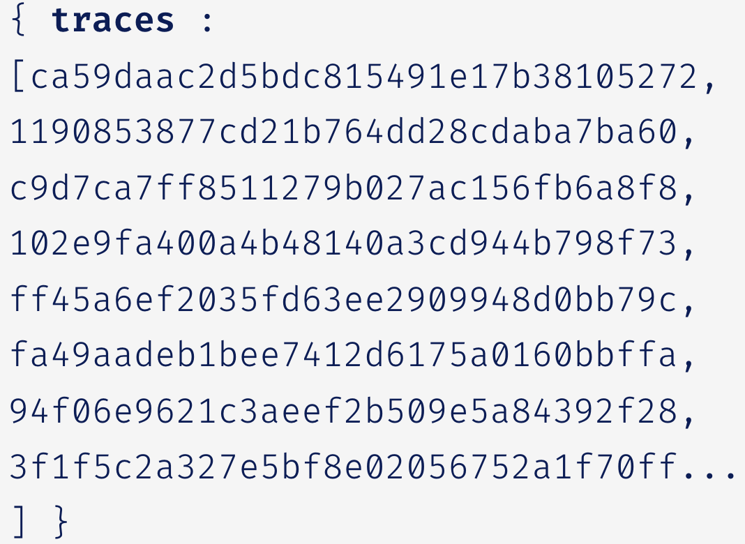
The traces page displays the traces that happened within a particular timestamp. This timestamp is based on which data point was clicked for the user. In the list of traces, there is some basic information about each of them. The user can click on any of the traces and they will get to the spans page.
In this page, it is possible to see all the spans that are part of a particular trace. The user can see a waterfall chart with the time that each span needed until it was completed. It is also possible to click on a particular span and see all the info that is stored about it.
6. Challenges & Trade-offs
We encountered several engineering challenges and forks in the road while creating Horus. What follows are a few of the most central to Horus’s design and infrastructure.
6.1 Connecting Metrics and Traces
A key feature of Horus is the clear link between metrics and traces. However, generating related metrics and traces is only the beginning — you have to store and query them while maintaining their relationship. How do you show the “right” traces?
Several observability tools rely on an assigned ID to maintain this connection. When the metrics and traces are being generated, before they’re stored in the database, the trace is given a metric ID and the metric is given a trace ID.
What happens, though, if a metric is related to multiple traces, or if a trace is related to multiple metrics? For example, a trace that contains an error span is easily included in all three of the RED metrics: it’s included in the amount of requests, the amount of errors, and the average wait time for a response. Does that trace get an array of metric IDs to choose from? Similarly, a metric data point generally covers an interval of time and does not have a one-to-one relationship with a trace. Should the metric point contain an array of all trace IDs that it covers?
Chronosphere, an observability platform, solves this issue by only storing one “important” trace per metric data point. If the trace passes some checks (e.g. it has a status code of 500), it is chosen as the most important trace and stored. All other traces that the metric data point referenced are discarded.
From a storage standpoint (especially with large microservices architectures), this trade-off makes sense. However, we didn’t like the idea of choosing what was important to the user. Yes, 500 server code traces are important, but what if, in less egregious-error situations, our algorithm chose the wrong “most important” trace? Doesn’t it depend on what the user is looking for?
The flow of Horus is from metric to traces, so the metric needs to hold information to point to the related traces. An array of 700+ IDs didn’t seem like a wise approach for when the user was receiving 70 RPS (requests per second), especially when that would need to be potentially also stored across EPS (errors per second) and latency (the metrics of Horus are captured every 10 seconds).
Thus, we settled on an organic connection: time. Since metrics cover an interval of time, we only have to query traces that fall within that interval of time in order to display the “right” traces. It sounds so simple!
And it would have been... were it not for timezones.
6.2 Timezones
Timezones brought two specific challenges: database storage and UI querying.
Database Storage
The metrics data points we generated with OpenTelemetry did not contain a timestamp for their creation. Because we needed to connect them to traces through a timeframe, we needed to give them one. Within the connector, we added a simple JavaScript Date() and converted it to a PostgreSQL timestamp upon insertion.
However, this Date object is subject to the time zone it detects. If the connector was being hosted on a machine with EST, all of the metrics data points had timestamps according to EST. If the connector was on a GMT machine, the timestamps all reflected GMT. This proved to be problematic because then the timezone is completely subjective — how can the UI server know what time frame to query for? Did the traces occur at 12:17 (EST) or 17:17 (GMT)?
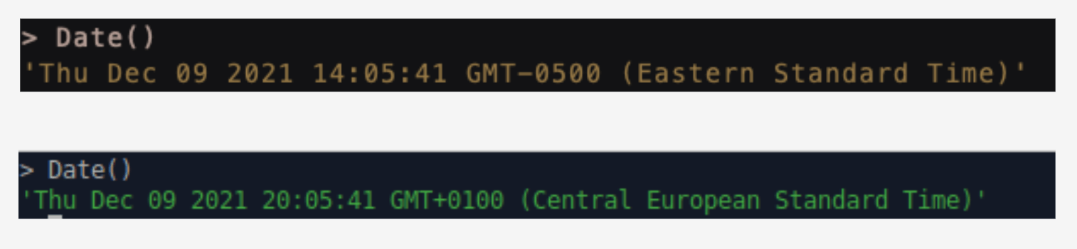
Date()We chose to conform to UTC for normalization and simplicity’s sake. Instead of depending on the local machine’s timezone, we added a conversion in the connector that ensures the timestamp for the metric conforms to UTC no matter what.
UI Querying
Some tools, such as Docker and PostgreSQL, default to the UTC timezone. Other technology, however, defaults to the browser which defaults to the local machine’s timezone. Nivo falls into the latter category.
Nivo, a data visualization library for React, is a key part of the Horus UI because these graphs are the main substance of the front page — which is all of the metrics. Although the metric data point timestamps were in UTC (in the database), the Nivo graph would convert it to the host machine’s time zone when displaying them. This worked fine for one of the creators of Horus living in England (GMT matches UTC timezone), but it did not work for any of his colleagues.
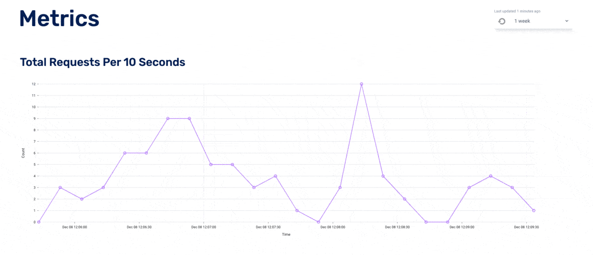
This affected how we queried traces from the database because we used that timestamp (now often inaccurate) to find all relevant traces. For example, if the metric datapoint is in EST and it then queries the database in EST (but the database is in UTC), the query is off by 5 hours, thus displaying the wrong traces (or no traces at all, as can be seen in the diagram below). We tried different dynamic approaches to conversions that would allow the program to self-correct. Sometimes our solutions would over-correct: it seemed the program thought it was in EST when it was in GMT, so it added five hours when it shouldn’t have.
We ultimately decided to allow the Nivo graph to display metrics in the timezone of the host machine, but then corrected it for trace queries. For simplicity’s sake, we chose to limit the user to only relative timeframes (e.g. the last 15 minutes, the last 24 hours, etc.). Said another way, we fixed it behind the scenes and hid the complexity from the user. We have a newfound respect for all who intimately work with timezone adaptability.
6.3 Visualization Trade-offs
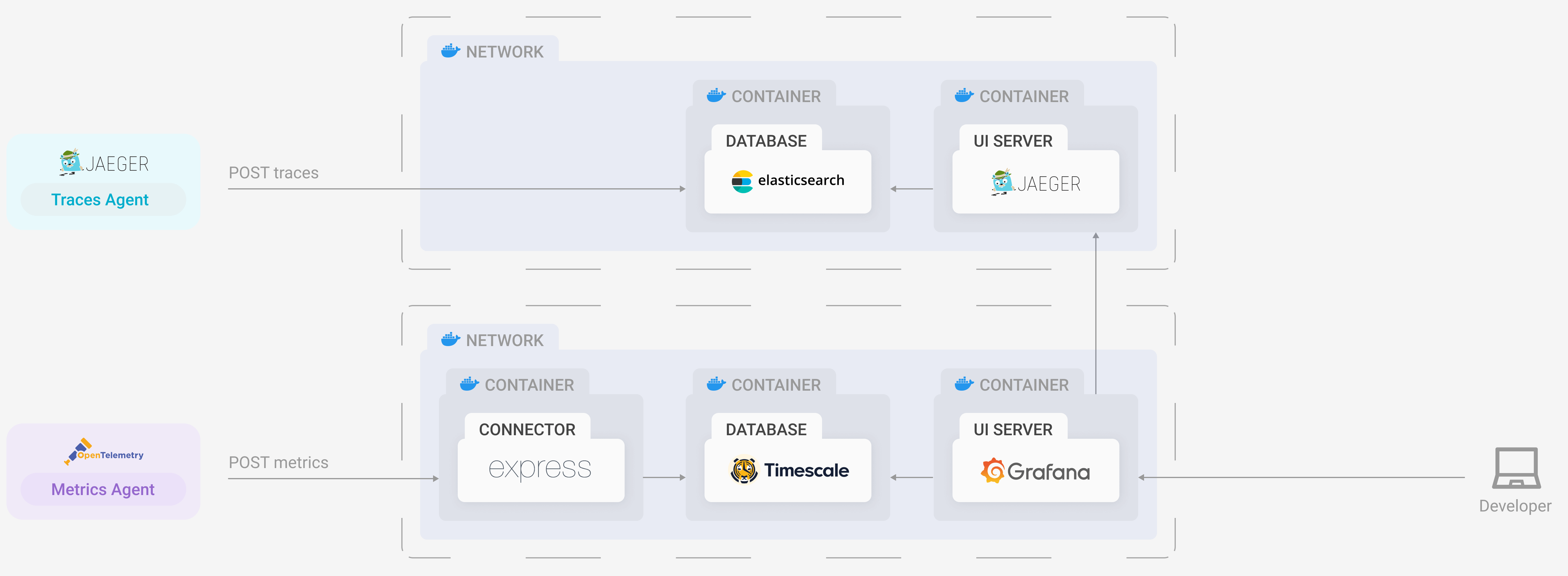
Our initial prototype used a visualization layer provided by Grafana, which is an open-source dashboard monitoring solution.
Grafana is one of the leading service providers for querying, visualizing, and interpreting telemetry data. It has the ability to receive and translate metrics, traces, and logs from a number of different storage sources and display them in a way that a user can easily gain insights and make decisions about their infrastructure.
In essence, Grafana provided the perfect solution to integrate the presentation stage into our application. It could visualize, and graph, both metrics and traces and had the ability to query our database of choice, TimescaleDB, using the built-in SQL querying utility.
Unfortunately, as we integrated Grafana into our own application infrastructure, it became apparent that there were limitations. While Grafana does offer a range of storage solutions, only some types of telemetry data can be queried from each database. In our case, we were able to query TimescaleDB for metrics, but we were unable to retrieve trace data that could be interpreted by Grafana. Grafana could only visualize trace data received from proprietary tracing solutions like Jaeger, Zipkin, X-Ray, or Tempo.
This left us with two potential options to explore.
First, we could commit to using Grafana as our visualization layer and generate traces using a pre-existing service like Jaeger or Zipkin. This was already an unattractive option because we wanted to use OpenTelemetry as our only mechanism for emitting telemetry data. Introducing more technologies meant introducing more dependencies and thereby adding greater complexity to our system.
Moreover, we only wanted a single database to store both traces and metrics to keep our data tightly coupled together. Including Jaeger or Zipkin would mean that we would need another database (both of these technologies were only compatible with Cassandra and Elasticsearch databases). We knew that by adding another database, the complexity to our system architecture would increase. Furthermore, it would open us up to more points of failure and potentially create time synchronicity issues.
Although this route clearly held difficulties along the way, we knew that the technologies were compatible, and that gave us confidence. It would just be a matter of configuring them to operate with one another. However, this would come at a cost. We would lose the simplicity and elegance of our initial architecture.
Our second option was more radical: we could build our own user interface.
Going down this route had several advantages. First, we could be faithful to our system’s architecture. By configuring our connector component to receive data, format it, and store it in a single database, we would be able to remove several unnecessary components from our infrastructure. This would reduce the overall complexity, and it would mitigate points of failure and possible time asynchronicity issues. We would rely on the frontend’s querying service to retrieve the data it needed from the database, format it to be interpreted by our graphical and visual components, and then pass it to our frontend to be rendered on our application interface.
Secondly, we would have complete control over how our user interface both operated and looked. This gave us the option to only include the key features we wanted to provide to the user, making the application a lot less visually intimidating to the type of user stated in our use case.
This route also had potential drawbacks. The upfront engineering effort would be much greater than working with preexisting components; we would need to implement the UI using a React Framework with a backend querying service to do the heavy lifting. Moreover, we would need to gain fluency in specific visualization tools such as graphing and chart packages to make the data more human-friendly.
Ultimately, the decision came down to adding complexity and working with preexisting components or keeping complexity to a minimum and investing the time and energy to produce an interactive interface.
After discussing and evaluating our options, we came to the conclusion that keeping the architecture as straightforward and lightweight as possible was essential to meeting our use case.
7. Horus Installation & Set Up
There are two steps to setting up Horus:
- Install and set up
horus-agentin the root service of the application - Deploy the Horus infrastructure via Docker
7.1 Setting Up Instrumentation
First, install the horus-agent with npm. This should be installed in the backend/server-side of the root service as well as each dependent service.

Then integrate it into your routes according to the npm README. Note that the MetricsAgent is only needed in the root service, whereas the TracingAgent should be placed in each dependent service so as to capture every single span.
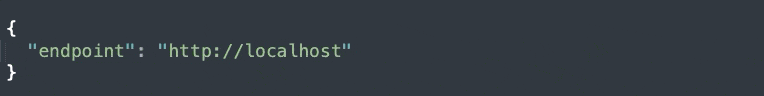
Second, update the config.json file to point to the endpoint of choice. If hosting Horus on a local machine, the endpoint can remain as is with localhost. If deploying to a different server (e.g. a DigitalOcean Droplet, an AWS EC2 instance, etc.), change the endpoint to point to that IP address or domain name.
The config.json file can be found within node_modules/horus-agent.
7.2 Deploying with Docker
Download Docker and/or Docker Compose if not already on the machine. Clone the horus-compose repo. In the terminal and in the same folder as the docker-compose.yaml file, run docker-compose up.

This deploys the full Horus infrastructure within a Docker network.
Voíla! Horus is set up.
8. Future Work
And that’s Horus! Although it fulfills all of Oliver’s needs, an open-source project is never fully finished. These are some of the features that we would like to pursue in future iterations:
- Developing more pages in the UI: e.g. a page where the user can choose a custom timeframe and view all the traces that happened in that timeframe
- Support more languages different in addition to JS for the generation of telemetry data
- Investigate the hardware and system requirements for hosting Horus for larger microservices
9. References
- https://en.wikipedia.org/wiki/Telemetry
- Software Telemetry, Jamie Riedesel, 2021
- https://signoz.io/blog/jaeger-vs-prometheus/
- https://blog.timescale.com/blog/timescaledb-vs-influxdb-for-time-series-data-timescale-influx-sql-nosql-36489299877/
- https://devinterrupted.com/opentelemetry-a-way-to-achieve-observability/
- https://lightstep.com/observability/#benefits-of-observability
- https://opentelemetry.io/docs/concepts/what-is-opentelemetry/
- https://opentelemetry.lightstep.com/metrics/
10. The Team
We are looking for opportunities. If you like our project, feel free to reach out!